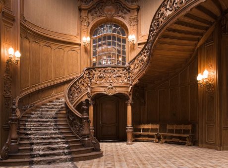
McMansions
– McMansions are the numero uno of terrible taste. If you start out with one of these, it’s all downhill after that. These eyesores should be nicknamed Big Uglies, and there’s little you can do to design around these messes.
– The McMansion trend is very illogical. After the 1970s, with oil shortages, cars became smaller and more fuel efficient. But the size of our houses has kept growing and growing.
– Our advice is to spend your money on better-quality details in a smaller home versus lower- quality details in a higher cubic-foot space. Quality trumps quantity, and if you’re betting the farm on being a McSize queen, you’re making the biggest initial design mistake of all. Period.
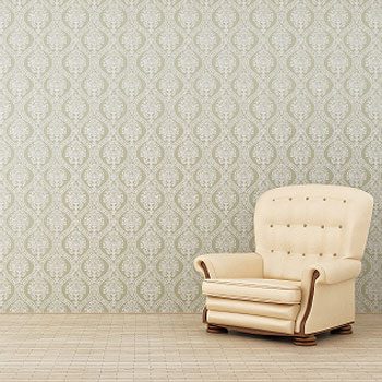
Timid Decorating
– Most people, particularly do-it-yourselfers, follow the path of least resistance and are far too shy in their design choices. They fall into a number of awful decorating
traps.
– If you like bright colors use bright colors. But if Aunt Gertrude left you a pink lamp in her will, that doesn’t mean you have to have an all-pink room. And if your friend has a brown-and-beige living room color scheme, by all means don’t think you are obligated to copy it in your home.
– Show your own taste and sense of self. Have the self-confidence to follow your own instincts about what is right for you and your home.
Stucco Quoins
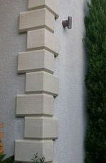
– Stucco Quoins, located on the outside corners of stucco houses, are typical to see a Georgian style detail of what looks like stone blocks or bricks, usually alternating in sizes. Stone quoins are typically part of a Georgian design where the exterior is totally stone or brick, with the quoins integrated.
– Modern quoins merely represent stone, yet they’re made of polystyrene. If you’re going to build a home, strive for integrity in both your design and your building materials. There is nothing wrong with stucco, but quoins are traditionally not found on Mediterranean-style stucco houses.
Snap-On Window Grids
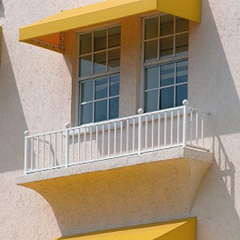
– Snap-On Window Grids make us want to eat glass. Traditional windows were usually divided into smaller window panes because of the high cost of glass and the absence of good technology to create large sheets of glass.
– New windows should have true divided panes of glass. These are called lights. The lights should be individually separated by wood or metal framing.
-Avoid using a fake plastic snap-on grid to hide the fact that you didn’t want to spend the money on purchasing true divided window lights.
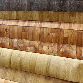
Fake Flooring
– Fake flooring, like laminate floor covering, is oftentimes made from oil byproducts. While committing the sin of being fake and lacking integrity, you are also guilty of using more fossil fuels.
– Real wood materials, if you purchase from either recycled antique flooring stock or from fast- growth or renewable-resource forests, are good green investments for your home. Likewise, explore those fantastic bamboo and cork flooring alternatives.
– Stone we love, but this is not the greenest floor choice you can make, unless you dip into the many recycled antique resources available. Products like terrazzo are stone byproducts and gravel-like compositions, far greener for your home than newly-quarried stone.
Overlooked Ceilings
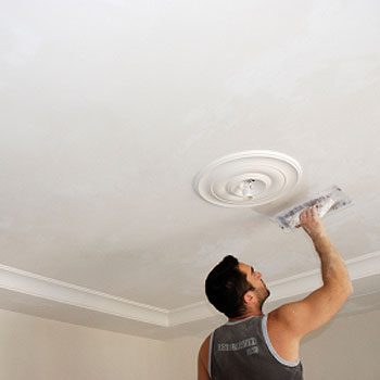
– People tend to overlight rooms. There is nothing wrong with a room illuminated with areas of light rather than a complete and unrelenting, glaring wash of light pouring down from the ceiling.
– Other technologies installed in the ceiling, like stereo speakers and air-conditioning grills, should be small, concealed whenever possible, and centered or aligned with central fixtures and above doors or windows. Too often this is not the case, and ceilings get turned into a hodgepodge that befits a discount warehouse.
– Painting ceilings white, just because that’s thought of as the norm, isn’t necessarily the right choice when you paint a room. If you want to use white, mix a certain percentage of your wall color paint into the white to soften it — usually between 10 and 50 percent. Or choose a ceiling color as an accent, like a color from one of your room fabrics. Another alternative is to paint the ceiling the same color as the walls, which creates the illusion of greater height in the room. Just avoid making your ceiling look like a Tupperware lid by having a bright white ceiling and strongly-colored walls.
Theme Decorating
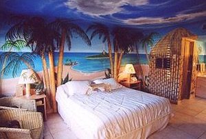
– Theme Decorating split our expert panel. Designer Nicola Chernicoff thought it was hideous, like the overdone Victoriana or Country French room with a period-glaring telephone or TV popping up like a space ship amongst the faux-period furnishings
– Designer Irwin Weiner felt interiors should reflect personality and style, and elements of themes are not necessarily terrible.
– Both agreed, however, that the danger in theme rooms is creating a look that is too staged and phony, like a movie set or a Walt Disney fantasy world.
Inspired by the popularity of YouTube and videos on the internet, Irwin Weiner and Jay Johnson created Design2Share in November 2006, an online podcast of advice and inspiration on homes, gardens, and architecture.